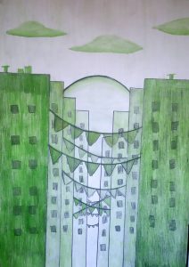
We are going to fill the fourth table with a monochromatic range, this means that we are going to play with the darkness and luminosity of a color.
Choose a color among the primaries; yellow, magenta, or blue; or between the secondary ones; green, purple or red.
Watch the first turorial:
1. Monochrome
After this we are going to do the artistic application:
HOW TO CREATE A SENSATION OF DEPTH
We are going to choose a color, and we are going to make a monochrome range. For them we are going to paint the middle box with the pure color, for example blue, from left to right we are going to press the pencil less and less until we reach white. This strip of colors is brighter than the other. From right to left we are going to press the pencil more and more and we are going to mix it with pencil 2b, to darken it even more. With this strip of colors we are playing with color saturation, the more mixed the color the less saturation it will have. If the color is purer, it is more saturated and if it is more mixed it will be less saturated. We can apply the monochrome color table to create a feeling of depth, for example in a landscape with mountains located at different distances. If we replace the mountains by buildings we get an urban landscape.


This drawing is a good example of the monochrome range made by a student:

Watch this tutorial:
2. Artistic application monochrome I attached a word document with the same instructions: How to create e sensation of depth
