MONOCHROME RANGE

We are going to fill the fourth table with a monochromatic range, this means that we are going to play with the darkness and luminosity of a color.

Choose a color among the primaries; yellow, magenta, or blue; or between the secondary ones; green, purple or red.

Watch the first turorial:

1. Monochrome

After this we are going to do the artistic application:

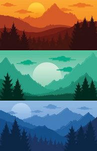
HOW TO CREATE A SENSATION OF DEPTH

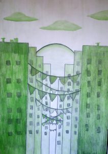
We are going to choose a color, and we are going to make a monochrome range. For them we are going to paint the middle box with the pure color, for example blue, from left to right we are going to press the pencil less and less until we reach white. This strip of colors is brighter than the other. From right to left we are going to press the pencil more and more and we are going to mix it with pencil 2b, to darken it even more. With this strip of colors we are playing with color saturation, the more mixed the color the less saturation it will have. If the color is purer, it is more saturated and if it is more mixed it will be less saturated. We can apply the monochrome color table to create a feeling of depth, for example in a landscape with mountains located at different distances. If we replace the mountains by buildings we get an urban landscape.


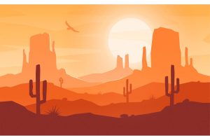
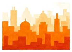
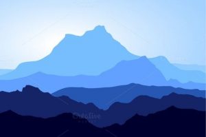
This drawing is a good example of the monochrome range made by a student:

Watch this tutorial:

2. Artistic application monochrome I attached a word document with the same instructions: How to create e sensation of depth

These monochrome portraits have been made by some students with black and white temperas.

Grey scale

We will see these two tutorials:

The first one is to make 5 boxes on a sheet, can be on a scketchbook sheet or on a normal sheet.

The second one is to learn how to make a grey scale.

The painters and draftsmen use the gray scale to give a feeling of three-dimensionality and volume to the two-dimensional drawings they make on paper or canvas, the examples are endless.

In this activity we will first draw a cube on a blank sheet and we will shade it to give it more volume and realism.

After the cube, which has planes and edges, we will move on to the sphere, whose surface is smoother. Giving volume to a smooth surface is more complicated, so I put it second.

Watch the tutorials in this order:

1. Doing a margin on the sheet. This is the first one because you have to do a margin on your sheet.

2. Shading a cube

3. Shading a sphere

Complementary harmony

Watch this presentation to know what a complementary color is:

0. Complementary colors

We are going to finish making the last table with a range of complementary colors. Choose a primary color and its complementary color, and check out this tutorial:

1. Complementary color.

The artistic application is to make the tail of a silhouette and color it with the same scale you did on the table. Check out this tutorial:

2. Complementary colors artistic application


Warm and cool colors

We are going to complete the 2nd and the 3rd table that we made two weeks ago, the 1st one has the gray scale.

In the 2nd table we are going to make a range of warm colors.

In the 3rd table a range of cool colors.

You can only use your colored pencils and the 3 primary colors, yellow, magenta and cyan blue.

You have to see the tutorials in this order:

1. Warm range

2. Cold range

To do this exercise I offer you two options:

1. A drawing using the silhouette of your hands.

2. A drawing using a symmetrical figure cut out of cardboard as a silhouette. You can use all the colored pencils you have but divide them between warm and cold colors. If you don’t have many colors you can mix them to get more shades.

In this work we’ll work with recycled materials as diary paper. This technic is called papier maché, and you have to mix paper with white glue. We’re going to make birds, and we’ll paint them using temperas. Each student will choose if he or she wants to paint the bird in warm or cool colors.

In this exercise we’ll work with temperas, applying our knowledge about cool and warm colors. In this case we’re going to make a selfportrait.

These are the final results.

Dot

Marcos Salvador Romera is a Murcia painter who made an exhibition at the Almudí Palace about the circus. Use the dot, the line and the plane, in a very simple way to create very descriptive and attractive images of the circus world.

We will use the temperas to create a  similar world  to the one created by this painter, using the primary and secondary colors, to create flat shapes and silhouettes such as circus tents, clowns, faces, etc. and then give them more dynamism and strength overlapping dots and lines.

Finally, I’ve uploaded the works that students made. Enjoy them.

Pinchando en este enlace podrás elegir 6 motivos diferentes a elegir uno, para reproducirlo en tu cuaderno.

https://docs.google.com/presentation/d/e/2PACX-1vSFj2iiFyPpkfHpN2tX8rndrYDlZrQYLEQwBwgDPirm0G-GE9S0dzegocpCHD71QdI8tqlfvB7lIhnj/pub?start=true&loop=false&delayms=3000